자료의 출처는 codecademy(https://www.codecademy.com/) 'front-end engineer' course이며, 학습 후 정리한 내용입니다.
⚡️ 올바르지 않은 내용이 있을 경우 댓글로 남겨주시면 감사하겠습니다. ⚡️
FLEXBOX
What is Flexbox?
CSS는 웹 페이지에 요소를 배치하는 데 사용할 수 있는 많은 도구와 속성을 제공한다.
플렉스 박스 레이아웃(flex box layout)에는 두 가지 중요한 구성 요소, flex container & flex items이 있다.
flex container는 flex items이 포함된 페이지의 요소이다.
flex container의 모든 직접 하위 요소는 flex item이다.
요소를 flex container로 지정하려면 요소의 display property를 flex or inline-flex로 설정한다.
item이 flex container가 되면 해당 하위 컨테이너의 동작 방식을 지정하는 데 사용할 수 있는 여러 가지 property가 있다.
이 과정에서 다룰 properties
- justify-content
- align-items
- flox-grow
- flex-shrink
- fles-basis
- flex
- flex-wrap
- align-content
- flex-direction
- flex-flow
display: flex
모든 요소는 플렉스 컨테이너(flex container)가 될 수 있다.
플렉스 컨테이너는 화면 크기 변화에 대응하는 웹 사이트를 만드는 데 유용한 도구이다.
플렉스 컨테이너의 하위 요소는 상위 컨테이너의 크기와 위치에 따라 크기와 위치를 변경한다.
요소가 플렉스 컨테이너가 되려면 해당 display property을 flex로 설정해야한다.
div.container {
  display: flex;
}
예제에서 class container가 있는 모든 div는 flex container이다.
만약 container가 하위 요소를 갖는다면, 하위요소들은 flex item이다.
declaration dispaly: flex;을 포함한 div는 block level을 유지하여, 다른 요소는 동일한 라인에 나타나지 않는다.
그러나 그것은 하위 요소의 동작을 변경할 것이다.
하위 요소는 새 라인에서 시작되지 않는다.

inline-flex
여러 개의 flex-container가 서로 inline으로 표시되도록 하는 방법
div 요소가 block-level-element가 되지 않기를 원한다면, display: inline을 사용한다.
Flexbox는 display property에 대한 inline-flex value을 제공하므로 inline 요소이기도 한 flex container를 생성할 수 있다.
<div class='container'>
  <p>I’m inside of a flex container!</p>
  <p>A flex container’s children are flex items!</p>
</div>
<div class='container'>
  <p>I’m also a flex item!</p>
  <p>Me too!</p>
</div>
.container {
width: 200px;
height: 200px;
display: inline-flex;
}위의 예제에서는 두 개의 컨테이너 div가 있다.
너비가 없으면 각 div는 페이지의 전체 너비를 늘린다.
또한 paragraph는 block-level 요소이기 때문에 각 div 내의 단락은 서로 위에 표시될 수 있다.
display property의 value를 inline-flex로 변경할 경우 페이지가 충분히 넓으면 div들이 서로 inline으로 표시된다.
위의 예에서는 플렉스 컨테이너의 크기가 설정되었다.
현재 상위 컨테이너의 크기가 하위 요소의 크기를 재정의한다.
상위 요소가 너무 작으면 상위 컨테이너의 크기를 수용할 수 있도록 플렉스 항목이 축소된다.
<div class='container'>
  <div class='child'>
    <h1>1</h1>
  </div>
  <div class='child'>
    <h1>2</h1>
  </div>
</div>
.container {
width: 200px;
}
.child {
display: inline-flex;
width: 150px;
height: auto;
}위의 예에서 .child divs는 .container div(200픽셀)보다 더 많은 너비(300픽셀)를 차지한다. .
child divs는 컨테이너 크기에 맞게 축소될 것이며, 이후에 배울 예정이다.

↓

justify-content
이전 예시에서 상위 컨테이너의 display value를 flex 또는 inline으로 변경했을 때 모든 하위 요소(flex item)가 상위 컨테이너의 왼쪽 상단 모서리로 이동했으며 이것이 플렉스 컨테이너와 해당 자식 컨테이너의 기본 동작이다.
주축을 따라 왼쪽에서 오른쪽으로 플렉스 항목이 어떻게 펼쳐지는지를 지정할 수 있다.
항목을 왼쪽에서 오른쪽으로 배치하기 위해 justify-content property 사용
.container {
  display: flex;
  justify-content: flex-end;
}
위의 예에서, justify-content의 value를 flex-end로 설정
이렇게 하면 모든 플렉스 항목이 플렉스 컨테이너의 오른쪽으로 이동한다.
justify-content property에 일반적으로 사용되는 다섯 가지 values
- flex-start: 모든 항목은 상위 컨테이너의 왼쪽에서 시작하여 항목 사이에 추가 공백 없이 순서대로 배치
- flex-end: 모든 항목이 순서대로 배치되고 마지막 항목은 상위 컨테이너의 오른쪽에서 시작되며, 항목 사이 또는 뒤에 추가 공간이 없음
- center: 모든 항목은 상위 컨테이너의 중앙에 앞뒤에 추가 공간이 없는 순서대로 배치
- space-around: 각 항목 앞과 뒤에 동일한 공간으로 항목이 배치되어 요소 사이의 공간이 두 배로 확장
- space-between: 항목 사이에 동일한 공간이 배치되지만 첫 번째 요소 앞이나 마지막 요소 뒤에 추가 공간이 없음("no extra space")
위의 정의에서 "no extra space"은 여백과 테두리가 존재하지만 요소 사이에 (특정 요소에 대한 스타일 규칙에 지정된 것보다) 더 많은 공간이 추가되지 않음을 의미한다.
각 개별 플렉스 항목의 크기는 이 property에 의해 변경되지 않는다.


align-items
align-items property: flex items을 수직으로 배치
.container {
  align-items: baseline;
}
위의 예에서는 align-items property가 baseline으로 설정된다. 즉, 각 항목의 내용 기준선이 정렬된다.
align-items property에 일반적으로 사용되는 다섯 가지 value
- flex-start: 모든 요소가 상위 컨테이너의 맨 위에 배치
- Flex-end: 모든 요소가 상위 컨테이너의 하단에 배치
- center: 모든 요소의 중심이 상위 컨테이너의 상단과 하단 중간에 배치
- baseline: 모든 항목의 내용 하단이 서로 정렬
- stretch: 가능한 경우, 항목은 컨테이너의 위에서 아래로 늘어남(default value, 지정된 높이를 가진 요소는 늘어나지 않으며, 최소 높이 또는 지정된 높이가 없는 요소는 늘어나게 됨).
이 다섯 가지 값은 상위 컨테이너의 cross axis(교차 축)을 따라 작동하는 방법을 알려준다.
min-height 및 max-height property에 익숙하지 않을 수 있지만 이전에 height와 width를 사용한 적이 있다.
min-height, max-height, min-width, max-width는 요소가 최소 특정 크기 또는 최대 크기인지 확인하는 속성이다.


* 참고: display: flex;를 사용할 때, align-items: strech는 flex container에서 자동으로 생성됨(기본값임)
(https://discuss.codecademy.com/t/why-do-my-flex-items-looked-stretched/370018)
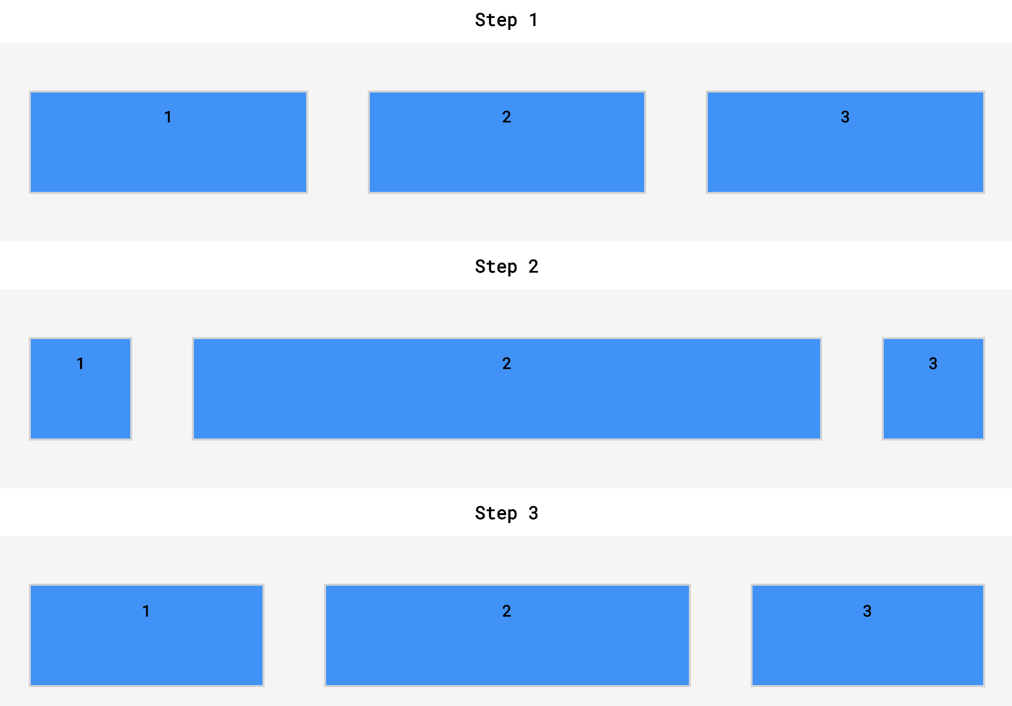
flex-grow
상위 컨테이너가 필요 이상으로 크면 기본적으로 flex items이 늘어나지 않는다.
flex-grow property는 flex-item요소가, flex-container 요소 내부에서 할당 가능한 공간의 정도를 선언한다.
만약 형제 요소로 렌더링 된 모든 flex-item 요소들이 동일한 flex-grow 값을 갖는다면, flex-container 내부에서 동일한 공간을 할당 받는다.
하지만 flex-grow 값으로 다른 소수값을 지정한다면, 그에 따라 다른 공간값을 나누어 할당받게 된다.
flex-grow property을 사용하면 컨테이너를 채우기 위해 item이 증가해야 하는지 여부와 그에 비례하여 증가해야 하는 item이 다른 item보다 더 많거나 적어야 하는지 지정할 수 있다.
<div class='container'>
  <div class='side'>
    <h1>I’m on the side of the flex container!</h1>
  </div>
  <div class='center'>
    <h1>I'm in the center of the flex container!</h1>
  </div>
  <div class='side'>
    <h1>I'm on the other side of the flex container!</h1>
  </div>
</div>
.container {
display: flex;
}
.side {
width: 100px;
flex-grow: 1;
}
.center {
width: 100px;
flex-grow: 2;
}위의 예에서 .container div는 display value가 flex이므로 세 개의 자식 div가 서로 옆에 배치된다.
.container div(이 경우 300픽셀보다 넓은 경우)에 추가 공간이 있으면 flex 항목이 증가하여 해당 공간을 채운다.
.center div는 .side div보다 두 배 더 늘어난다.
예를 들어, 60개의 추가 픽셀이 있는 경우 center div는 30개의 픽셀을 흡수하고 side div는 각각 15개의 픽셀을 흡수한다.


요소에 대해 최대 너비를 설정하면 흡수할 공간이 더 많아져도 그 이상으로 커지지 않는다.
이전까지의 flex 관련 property는 플렉스 컨테이너 또는 상위 요소에 declaration되며, flex-grow property는 flex item에 대해 선언된 첫 번째 property이다.
<!DOCTYPE html>
<html>

<head>
  <title>Flex Grow and Shrink</title>
  <link href='style.css' rel='stylesheet' />
  <link href='https://fonts.googleapis.com/css?family=Roboto+Mono' rel='stylesheet'>
</head>

<body>
  <h1>Step 1</h1>
  <div id='top'>
    <div class='top side'>
      <h2>1</h2>
    </div>
    <div class='top center'>
      <h2>2</h2>
    </div>
    <div class='top side'>
      <h2>3</h2>
    </div>
  </div>
  <h1>Step 2</h1>
  <div id='middle'>
    <div class='middle side'>
      <h2>1</h2>
    </div>
    <div class='middle center'>
      <h2>2</h2>
    </div>
    <div class='middle side'>
      <h2>3</h2>
    </div>
  </div>
  <h1>Step 3</h1>
  <div id='bottom'>
    <div class='bottom side'>
      <h2>1</h2>
    </div>
    <div class='bottom center'>
      <h2>2</h2>
    </div>
    <div class='bottom side'>
      <h2>3</h2>
    </div>
  </div>
</body>

</html>
body {
  margin: 0;
  border: 0;
  font-family: 'Roboto Mono', monospace;
}

h1 {
  font-size: 18px;
}

h2 {
  font-size: 16px;
}

h1,
h2 {
  text-align: center;
}

.top,
.middle,
.bottom {
  width: 100px;
  height: 100px;
  background-color: dodgerblue;
  border: 2px solid lightgrey;
  margin: 10px 30px;
}

.top.side {
  flex-grow: 1;
}

.top.center {
  flex-grow: 1;
}

.middle.side {

}

.middle.center {
  flex-grow: 1;
}

.bottom.side {
  flex-grow: 1;
}

.bottom.center {
	flex-grow: 2;
}

#top,
#middle,
#bottom {
  display: flex;
  background-color: Whitesmoke;
  justify-content: center;
  min-height: 200px;
  align-items: center;
}
flex-shrink
flex-grow property가 비례적으로 flex items을 확장하는 것처럼, flex-shrink property를 사용하여 축소할 요소와 비율을 지정할 수 있다.
이전의 연습에서 property을 선언하지 않았음에도 불구하고, flex container가 너무 작을 때 flex item이 줄어들었다.
그 이유는 flex-shrink의 default value가 1이기 때문
그러나 flex-grow의 default value는 0이기 때문에 flex-grow property를 선언하지 않는 한 flex items은 확장되지 않는다.
<div class='container'>
  <div class='side'>
    <h1>I'm on the side of the flex container!</h1>
  </div>
  <div class='center'>
    <h1>I'm in the center of the flex container!</h1>
  </div>
  <div class='side'>
    <h1>I'm on the other side of the flex container!</h1>
  </div>
</div>
.container {
display: flex;
}
.side {
width: 100px;
flex-shrink: 1;
}
.center {
width: 100px;
flex-shrink: 2;
}예제에서 .container div가 너무 작아서 해당 안에 요소를 넣을 수 없는 경우 .center div는 .side div보다 두 배 더 축소된다.
콘텐트가 60픽셀이나 너무 커서 콘텐트를 둘러싸고 있는 flex container에 비해 .center div는 30픽셀, 외부 div는 각각 15픽셀씩 축소된다.
여백은 flex-grow와 flex-shrink에도 영향을 받지 않는다.
최소 너비와 최대 너비는 flex-grow 및 flex-shrink보다 우선한다.
flex-grow와 마찬가지로, flex-shrink는 상위 컨테이너가 너무 작거나 브라우저가 조정된 경우에만 사용된다.
<!DOCTYPE html>
<html>

<head>
  <title>Flex Grow and Shrink</title>
  <link href='style.css' type='text/css' rel='stylesheet' />
  <link href='https://fonts.googleapis.com/css?family=Roboto+Mono' rel='stylesheet'>
</head>

<body>
  <h1>Step 1</h1>
  <div id='top'>
    <div class='top side'>
      <h2>1</h2>
    </div>
    <div class='top center'>
      <h2>2</h2>
    </div>
    <div class='top side'>
      <h2>3</h2>
    </div>
  </div>
  <h1>Step 2</h1>
  <div id='middle'>
    <div class='middle side'>
      <h2>1</h2>
    </div>
    <div class='middle center'>
      <h2>2</h2>
    </div>
    <div class='middle side'>
      <h2>3</h2>
    </div>
  </div>
  <h1>Step 3</h1>
  <div id='bottom'>
    <div class='bottom side'>
      <h2>1</h2>
    </div>
    <div class='bottom center'>
      <h2>2</h2>
    </div>
    <div class='bottom side'>
      <h2>3</h2>
    </div>
  </div>
</body>

</html>
body {
  margin: 0;
  border: 0;
  font-family: 'Roboto Mono', monospace;
}

h1 {
  font-size: 18px;
}

h2 {
  font-size: 16px;
}

h1,
h2 {
  text-align: center;
}

.top,
.middle,
.bottom {
  width: 100px;
  height: 100px;
  background-color: dodgerblue;
  border: 2px solid lightgrey;
  margin: 10px 30px;
}

.top.side {
  flex-shrink: 2;
}

.top.center {

}

.middle.side {
  flex-shrink: 0;
}

.middle.center {

}

.bottom.side {

}

.bottom.center {
	flex-shrink: 2;
}

#top,
#middle,
#bottom {
  display: flex;
  background-color: whitesmoke;
  justify-content: center;
  min-height: 200px;
  align-items: center;
}

flex-basis
flex-grow와 flex-shrink에서, divs의 dimension은 CSS로 설정된 높이와 너비에 의해 결정된다.
flex-basis property: flex item의 너비를 지정하는 또 다른 방법으로, flex-basis를 사용하면 item이 확장되거나 축소되기 전에 item의 너비를 지정할 수 있다.
flex-basis property는 플렉스 아이템의 초기 크기를 지정. box-sizing을 따로 지정하지 않는다면 콘텐츠 박스의 크기를 변경한다.
<div class='container'>
  <div class='side'>
    <h1>Left side!</h1>
  </div>
  <div class='center'>
    <h1>Center!</h1>
  </div>
  <div class='side'>
    <h1>Right side!</h1>
  </div>
</div>
.container {
display: flex;
}
.side {
flex-grow: 1;
flex-basis: 100px;
}
.center {
flex-grow: 2;
flex-basis: 150px;
}예제에서 .container div의 공간이 적당하면 .side div는 100픽셀 너비가 되고 .center div는 150픽셀 너비가 된다(350픽셀, 여백과 테두리에 대해서는 약간의 추가).
.container div가 더 크면 .center div는 .side div보다 두 배 더 많은 공간을 흡수한다.
* 참고: auto 값을 가지지 않은 flex-basis와 width(flex-direction: column인 경우 height)값을 동시에 적용한 경우 flex-basis가 우선함.
(참고: https://developer.mozilla.org/ko/docs/Web/CSS/flex-basis)
flex\
flex property을 사용하여 flex-grow, flex-shrink, flex-basis를 모두 한 줄로 선언한다.
참고: flex property는 display property에 사용되는 flex value와 다르다.
.big {
  flex-grow: 2;
  flex-shrink: 1;
  flex-basis: 150px;
}

.small {
  flex-grow: 1;
  flex-shrink: 2;
  flex-basis: 100px;
}
예제에서, class big을 가진 모든 요소는 class small을 가진 요소보다 두 배 더 커진다.
big items이 small items보다 두 배 더 크다는 것이 아니라, 단지 여분의 공간을 더 많이 차지한다는 것을 의미한다.
이 세 가지 속성을 한 줄로 선언하는 방법
.big {
  flex: 2 1 150px;
}

.small {
  flex: 1 2 100px;
}
예제에서 flex property를 사용하여 flex-grow, flex-shrink, flex-basis(이 순서대로)의 값을 모두 한 줄로 선언
.big {
 flex: 2 1;
}
위의 예에서는 flex property를 사용하여 flex-grow, flex-shrink를 선언(flex-basis는 선언 X)
.small {
  flex: 1 20px;
}
위의 예에서는 flex property을 사용하여 flex-grow, flex-basis를 선언
(2개의 값을 사용하여 flex-shrink, flex-basis만 설정할 수 있는 방법은 없다)
flex-wrap
flex-wrap property: 컨텐츠가 컨테이너에 맞게 축소되는 것을 원치 않을 때, flex item을 다음 행으로 이동시키는 선언
flex-wrap property 세 가지 값
- wrap: 행에 맞지 않는 플렉스 컨테이너의 하위 요소가 다음 줄로 이동
- wrap-reverse: wrap과 동일한 기능을 제공하지만, 플렉스 컨테이너 내의 행 순서가 반대
(예: 2-row flexbox에서는 wrap 컨테이너의 첫 번째 행이 wrap-reverse에서 두 번째 행이 되고, wrap 컨테이너의 두 번째 행이 wrap-reverse에서 첫 번째 행이 됨.) - nowrap: 항목이 래핑되지 않도록 함. 이 값은 기본값이며 다른 CSS 규칙에 의해 설정된 래핑 값만 재정의하면 된다.
<div class='container'>
  <div class='item'>
    <h1>We're going to wrap!</h1>
  </div>
  <div class='item'>
    <h1>We're going to wrap!</h1>
  </div>
  <div class='item'>
    <h1>We're going to wrap!</h1>
  </div>
</div>
.container {
display: inline-flex;
flex-wrap: wrap;
width: 250px;
}
.item {
width: 100px;
height: 100px;
}예제에서 세 개의 플렉스 아이템이 상위 플렉스 컨테이너에 포함되어 있다.
플렉스 컨테이너는 폭이 250픽셀에 불과하므로 100픽셀 너비의 플렉스 아이템 3개가 인라인으로 맞지 않다.
flex-wrap: wrap을 설정하면 세 번째 오버플로 아이템이 다른 두 항목 아래에 있는 새 줄에 나타난다.

참고: flex-wrap property는 flex 컨테이너에 선언된다.

align-content
이제 요소를 다음 줄로 묶을 수 있으므로 동일한 컨테이너 내에 여러 행의 플렉스 아이템이 있을 수 있다.
이전 연습에서는 align-items property를 사용하여 플렉스 컨테이너의 상단에서 하단으로 플렉스 아이템을 사용했다.
align-items은 단일 행 내에서 요소를 정렬하기 위한 것이다.
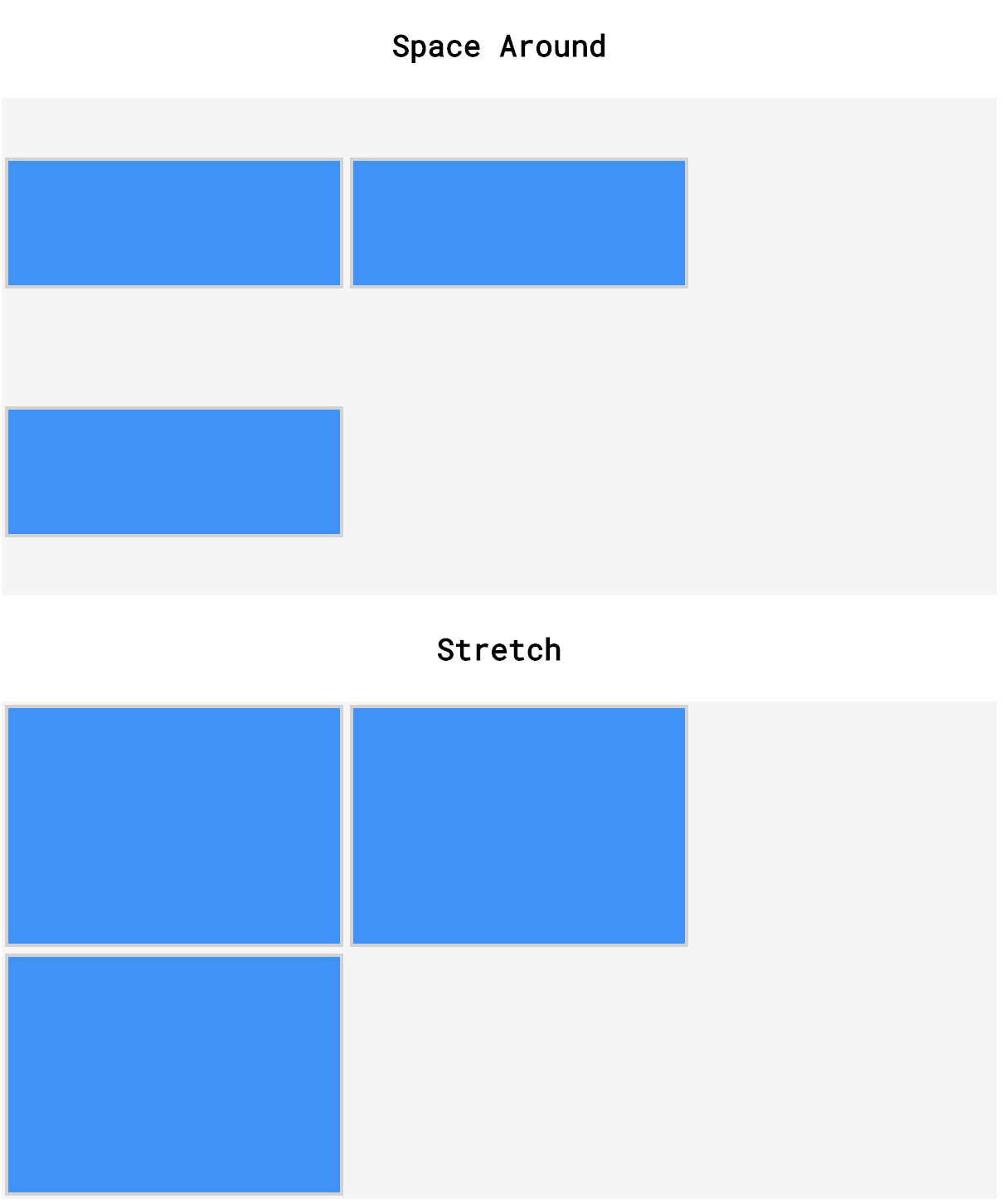
플렉스 컨테이너에 컨텐츠 행이 여러 개 있는 경우 align-content를 사용하여 행의 위쪽과 아래쪽 사이를 띄울 수 있다.
일반적으로 사용되는 align-content 값 중 일부
- flex-start: 모든 요소 행은 상위 컨테이너의 맨 위에 배치되며, 그 사이에 추가 공간이 없다.
- flex-end: 모든 요소 행은 사이에 추가 공간이 없는 상위 컨테이너의 하단에 배치
- center: 모든 요소 행이 사이에 추가 공간이 없는 상위 요소의 중앙에 배치
- space-between: 모든 요소 행은 첫 번째 또는 마지막 행보다 아래에 공백 없이 컨테이너의 상단에서 하단까지 균일한 간격으로 배치
- space-around: 모든 요소 행은 컨테이너의 상단에서 하단까지 균일한 간격으로 배치되며, 상단과 하단에 동일한 양의 공간이 각 요소 사이에 배치
- stretch: 최소 높이를 지정하거나 높이가 지정되지 않은 경우 요소의 행이 확장되어 상위 컨테이너를 위에서 아래로 채움(기본값).
<div class='container'>
  <div class='child'>
    <h1>1</h1>
  </div>
  <div class='child'>
    <h1>2</h1>
  </div>
  <div class='child'>
    <h1>3</h1>
  </div>
  <div class='child'>
    <h1>4</h1>
  </div>
</div>
.container {
display: flex;
width: 400px;
height: 400px;
flex-wrap: wrap;
align-content: space-around;
}
.child {
width: 150px;
height: 150px;
}예제에서 플렉스 컨테이너 내부에 네 개의 플렉스 아이템이 있다.
플렉스 아이템은 각각 150픽셀 너비로 설정되지만 상위 컨테이너의 너비는 400픽셀에 불과하다.
즉, 두 개 이하의 요소를 inline으로 표시할 수 있다.
나머지 두 요소는 다음 라인으로 감싸고 플렉스 컨테이너 내부에 두 줄의 div가 있다.
align-content property는 공간 space-around 값으로 설정되며, 이는 두 개의 div 행이 첫 번째 행 앞과 두 번째 행 뒤에 동일한 간격으로 상위 컨테이너의 상단에서 하단으로 균일하게 간격되고 행 사이에 이중 공간이 있음을 의미
참고: align-content property는 플렉스 컨테이너에 선언된다.
<!DOCTYPE html>
<html>

<head>
  <title>Align Content</title>
  <link href='style.css' rel='stylesheet' />
  <link href='https://fonts.googleapis.com/css?family=Roboto+Mono' rel='stylesheet'>
</head>

<body>
  <h1>Flex Start</h1>
  <div class='container' id='flexstart'>
    <div class='left'></div>
    <div class='center'></div>
    <div class='right'></div>
  </div>
  <h1>Flex End</h1>
  <div class='container' id='flexend'>
    <div class='left'></div>
    <div class='center'></div>
    <div class='right'></div>
  </div>
  <h1>Center</h1>
  <div class='container' id='center'>
    <div class='left'></div>
    <div class='center'></div>
    <div class='right'></div>
  </div>
  <h1>Space Between</h1>
  <div class='container' id='between'>
    <div class='left'></div>
    <div class='center'></div>
    <div class='right'></div>
  </div>
  <h1>Space Around</h1>
  <div class='container' id='around'>
    <div class='left'></div>
    <div class='center'></div>
    <div class='right'></div>
  </div>
  <h1>Stretch</h1>
  <div class='container' id='stretch'>
    <div class='left'></div>
    <div class='center'></div>
    <div class='right'></div>
  </div>
</body>

</html>
body {
  font-family: 'Roboto Mono', monospace;
}

h1 {
  margin: 20px;
  text-align: center;
  font-size: 18px;
}

.container {
  height: 300px;
  width: 600px;
  background-color: whitesmoke;
  display: flex;
  flex-wrap: wrap;
  margin: auto;
}

.left,
.center,
.right {
  min-height: 75px;
  width: 200px;
  margin: 2px;
  background-color: dodgerblue;
  border: 2px solid lightgrey;
}

#flexstart {
  align-content: flex-start;
}

#flexend {
  align-content: flex-end;
}

#center {
  align-content: center;
}

#between {
  align-content: space-between;
}

#around {
  align-content: space-around;
}


flex-direction
플렉스 컨테이너에는 main axis과 cross axis의 두 축이 있다.
기본적으로 main axis는 수평이고 cross axis는 수직이다.
플렉스 아이템을 main axis로 배치하는 속성
- justifty-content
- flex-wrap
- flex-grow
- flex-shrink
플렉스 아이템을 cross axis로 배치하는 속성
- align-items
- align-content
flex-direction property를 사용하여 main axis와 cross axis를 전환할 수 있다.
만약 flex-direction property를 추가하고 그것에 column 값을 준다면, flex item은 수평이 아닌 수직으로 정렬된다.
<div class='container'>
  <div class='item'>
    <h1>1</h1>
  </div>
  <div class='item'>
    <h1>2</h1>
  </div>
  <div class='item'>
    <h1>3</h1>
  </div>
  <div class='item'>
    <h1>4</h1>
  </div>
  <div class="item">
    <h1>5</h1>
  </div>
</div>
.container {
display: flex;
flex-direction: column;
width: 1000px;
}
.item {
height: 100px;
width: 100px;
}예제에서는 5개의 div가 수직 열에 배치된다.
이 모든 div는 하나의 수평 행에 들어갈 수 있다.
그러나 column 값은 브라우저에 divs를 다른 divs 위에 쌓도록 지시한다.
위에서 설명한 것처럼, justify-content와 같은 속성은 이전 예에서와 같은 방식으로 동작하지 않는다.
flex-direction property가 사용할 수 있는 네 가지 value
- row: 요소는 왼쪽 상단 모서리에서 시작하여 상위 요소를 가로질러 왼쪽에서 오른쪽으로 배치(기본값).
- row-reverse: 요소는 오른쪽 상단 모서리에서 시작하여 상위 요소를 가로질러 오른쪽에서 왼쪽으로 배치
- column: 요소는 왼쪽 상단 모서리에서 시작하여 상위 요소의 상단에서 하단으로 배치
- column reverse: 요소는 왼쪽 하단 모서리에서 시작하여 상위 요소의 아래쪽에서 위쪽으로 배치
참고: flex-direction property는 flex 컨테이너에 선언된다.
(flex-direction: row-reverse/column-reverse; 를 사용하는 이유: https://discuss.codecademy.com/t/why-would-we-use-flex-direction-row-reverse-column-reverse/370023)
flex-flow
단축형 flex-flow property는 flex-wrap property와 flex-direction property를 모두 한 줄로 선언하는 데 사용
.container {
  display: flex;
  flex-wrap: wrap;
  flex-direction: column;
}
위의 예제에서 한 행으로 수행할 수 있는 작업을 수행하기 위해 두 줄을 사용
.container {
  display: flex;
  flex-flow: column wrap;
}
위의 예에서, flex-flow declaration의 첫 번째 값은 flex-direction value이고 두 번째 값은 flex-wrap value이다.
모든 flex-direction 및 flex-wrap 값이 허용됨
참고: flex-flow property는 flex container에 선언된다.
*Question: flex-flow property에 single value 사용 가능한가?
사용 가능!
(참고: https://discuss.codecademy.com/t/can-we-use-flex-flow-with-a-single-value/370024)
Noted Flexboxes
플렉스 컨테이너를 서로 내부에 배치할 수 있다.
<div class='container'>
  <div class='left'>
    <img class='small' src='#'/>
    <img class='small' src='#'/>
    <img class='small' src='#' />
  </div>
  <div class='right'>
    <img class='large' src='#' />
  </div>
</div>
.container {
display: flex;
justify-content: center;
align-items: center;
}
.left {
display: inline-flex;
flex: 2 1 200px;
flex-direction: column;
}
.right {
display: inline-flex;
flex: 1 2 400px;
align-items: center;
}
.small {
height: 200px;
width: auto;
}
.large {
height: 600px;
width: auto;
}예제에서 세 개의 작은 이미지를 가진 div가 페이지(.left) 왼쪽에 위에서 아래로 표시된다.
또한 페이지(.right) 오른쪽에 표시되는 하나의 큰 이미지가 있는 div도 있다.
왼쪽 div는 더 작은 flex-basis를 가지지만 더 많은 추가 공간을 채우기 위해 확장되며, 오른쪽 div는 더 큰 flex-basis를 가지지만 더 적은 추가 공간을 채우기 위해 확장된.
두 div 모두 플렉스 아이템과 플렉스 컨테이너이다.
항목은 상위 컨테이너에 배치되는 방법과 해당 컨테이너에 있는 플렉스 아이템 하위 항목이 배치되는 방법을 지시하는 property를 가진다.
리뷰
- display: flex는 요소를 flex item이 포함된 block-level 컨테이너로 변경
- display: inline-flex를 사용하면 여러 개의 플렉스 컨테이너가 서로 inline으로 나타남.
- justify-content는 main axis를 따라 item을 띄우는 데 사용
- align-items는 cross axis를 따라 item을 띄우는 데 사용
- flex-grow는 main axis를 따라 얼마나 많은 공간(및 어느 비율)을 흡수하는지를 지정하는 데 사용
- flex-shrink는 얼마나 flex item이 축소되는지, 그리고 main axis을 따라 어떤 비율로 축소되는지 지정하는 데 사용
- flex-basis는 flex-grow 및/또는 flex-shrink으로 스타일링된 요소의 초기 크기를 지정하는 데 사용
- flex는 단일 선언에서 flex-grow, flex-shrink, flex-basis을 지정하는 데 사용
- flex-wrap은 플렉스 컨테이너가 충분히 크지 않은 경우 요소가 cross axis를 따라 이동하도록 지정
- align-content는 cross axis을 따라 행을 띄우는 데 사용
- flex-direction은 main axis와 cross axis를 지정하는 데 사용
- flex-flow는 하나의 선언에서 flex-wrap, flex-direction을 지정하는 데 사용
- 플렉스 컨테이너는 컨테이너의 하위 항목을 위한 display: flex 또는 display: inline-flex를 선언하여 서로 중첩될 수 있다.
참고
Making a Website Responsive: Layout with Flexbox Cheatsheet | Codecademy
Learn CSS Flexbox to create flexible page layouts.
www.codecademy.com
Can we use flex-wrap and flex-shrink on the same flex container?
Question Can we use flex-wrap and flex-shrink on the same flex container? Answer We can use flex-wrap and flex-shrink on the same container, flex-wrap does not negate the use of flex-shrink. Take for example an instance where our content would otherwise ov
discuss.codecademy.com
When should I nest flexboxes?
Question When should I nest flexboxes? Answer We can use nested flexboxes when we require the content of one of our flex items to be easily aligned, ordered, spaced and/or scaled in a horizontal or vertical direction. Imagine a hypothetical layout where we
discuss.codecademy.com
How do we decide when to use flexbox?
Question How do we decide when to use flexbox? Answer When deciding whether to use flexbox or not we should consider a few things: Can the scaling, spacing, alignment, or ordering issue be solved using more basic CSS? If so we should not use flexbox. Do we
discuss.codecademy.com
'IT > CSS' 카테고리의 다른 글
| Responsive Design: Grids and Debugging (0) | 2021.06.05 |
|---|---|
| Documentation and Research (0) | 2021.06.05 |
| Responsive Design - II (0) | 2021.05.16 |
| Responsive Design (0) | 2021.05.11 |
| Secondary Navigation (0) | 2021.05.08 |


댓글